Tuesday, 23 April 2013

Brief 3 - Comedy Edit

For our final brief, we have been instructed to fine cut one scene from the comedy 'Out Of Date'. We were informed that the dinner scene was very difficult to attempt, due to the difficulties in continuity and the fact that the room itself was too small to properly capture a quality scene.

Taking this on board, I have decided to choose a different scene and perfect that. After looking through each scene, I've decided that the opening scene in the car park is the best one to edit. The scene seems interesting enough, and it uses itself as an introduction to the rest of the film.

The scene I have chosen to edit.

The final edit must be near 2 minutes long, so if I haven't reached the required length after the edit I will implement scene 2 into the film, the one in which the pair return to the house in their milk van.

I'm looking forward to working individually on this edit, as I'll be able to see my own capabilities and solve any problems I come across on my own. I've never edited a comedy before, so this is new to me. I expect the timing of the cuts to be one of the key factors in achieving a good edit.

Monday, 15 April 2013

'Bourne Ultimatum' (2007)

Christopher Rouse
Christopher Rouse won the 'Best Film Editing' Oscar for his work on 'Bourne Ultimatum' (2007). Rouse shows mastery of story, character and pacing.

I have seen all of the Bourne films apart from the latest one, and the editing style has always impressed/intrigued me. At time however the editing is so fast-paced and jerky that you lose track of what's happening, and in some cases it makes you feel nauseous. I can understand the style of editing chosen though, the action on-screen, Bourne's constant fugitive status and need to get away. The editing style puts the audience in the front seat of the car and doesn't hold back.

"It takes tremendous skill to be able to weave half-second fragments of these shots into a coherent scene with logical pacing. There are so many possible combinations of shots that a weaker editor could miss the mark entirely."

The most memorable scene that features the most memorable edit is the scene in which Bourne is running along the rooftops, jumps through a window and fights a man in an apartment. The hand-held footage used almost throughout the scene adds to the intensity of the scene. It makes the audience feel part of the action and the cuts seem as if they symbolise Bourne's mind and psychical state.


The apartment scene/fight.
I have always enjoyed the use of hand-held footage, I think it's an effective piece of film-making that works especially well in thrillers, action and horror genres. Editing hand-held footage is always a fun task; with the camera moving around so much, you're able to make the important decisions on how long to stay on one shot. In most cases, you're required to make several cuts in just a few seconds to remain the level of continuity and relative footage on-screen.

Friday, 12 April 2013

The use of Voiceover

The use of voiceover in some of the programmes shown on UK TV appears to be used for comical effect, and too of course keep the audience informed and on-track with what's happening on-screen. The timing of voiceover in film is very important. Knowing when to bring in the voiceover and when not to use it.

We have used voiceover/narration for the first two briefs, the rock climbing documentary and 'Night Journey'. At first it was difficult knowing when and not to use it. But after spending countless hours editing and implementing the use of voiceover in film it now feels a natural process.

'Come Dine With Me' and 'Magaluf Weekender'

In both of these programmes, the use of voiceover in my opinion is used for comical effect. Secondly but still importantly the informative value.

Comical effect - 'insulting' the people on the show, often with sarcasm.

Informative - Introducing the show, explaining what's happening, their backgrounds etc.

A cookery show pitting contestants against each other to wine and dine, then rate their hosts.
A reality/documentary following four people working in Magaluf as hotel assistants/party hosts. 

Thursday, 11 April 2013

Montages

A montage in film is an editing technique in which a series of short shots are edited into a sequence to condense space, time, and information. A montage is a great way of getting a lot of information across to the audience in a short period of time. Examples of effective montages are shown in 'Election' which I briefly discussed near the beginning of this blog, and the '127 Hours' introduction that I also discussed at an earlier date.

The element of time is expressed in montages; condensing a long period of time into short cuts, often combined with a soundtrack. 

Team America: World Police (2004) Montage

The montage scene in Team America could be seen as a satire aimed at other films who use the technique.  The soundtrack used in the montage features the lines "We're gonna need a montage, it takes a montage, to show the passage of time. Show lots of things happening at once, remind everyone of what's going on, every shot show a little improvement, to show it all would take too long. If you end on a fade it seems like more time has passed." 

I think this is brilliance, displaying a montage that contributes to the overall story ark of the film and ironically using the soundtrack to ridicule the technique, but actually doing it in the film. In this case, the shots chosen show the main protagonist working out/training in order to attack the villain in the film and rescue his friend.


Team America aside, most films use the montage technique to great effect in order to progress the story forward and put the audience on a level playing field with the characters on-screen. 

I have yet to create a proper montage during my last years at Uni, but I have edited footage together in the past to music to create a montage. I think it's a fun and interesting process that I would happily do again. 

Sunday, 7 April 2013

Documentary Feedback

We received highly positive feedback on the final piece, however there are some things that we were recommended to change...

• Take out the overexposed shots i.e. the ones in the snow
• If the climber says something of importance, or is highly passionate, then show him saying it
• Longer fades in some of the music/narration
• Two endings! Eliminate this

I agree with all the comments mentioned, and me and Fraser will change this accordingly to create a stronger, more visually pleasing piece.

Saturday, 6 April 2013

BLOODROP

 'BLOODROP' is a short film directed by Alexei Popogrebsky. The film plays with the idea of perception, what is real and what is not. It tricks the audience's brain throughout its 6 and a half minute length and keeps you wanting more. One of the main reasons the film was created was to take the opportunity to test some concepts in 3D, and see how it would translate to 2D. I've always seen 3D as a gimmick/a way of getting more money out of people, but after seeing this short film, it's clear that if implemented in a different way, it can work brilliantly. (I've yet to view Bloodrop in 3D, but I imagine that with the visuals on-screen and the complexity of the idea, it will work). The edit is well-consructed and fits nicely with the visuals, I will discuss this below.


Not one word is said throughout the film, but I still feel a strong connection to the main character. This is due to the facial expressions, his mannerisms, movements and body language throughout the piece. The music also helps progress the film forward.


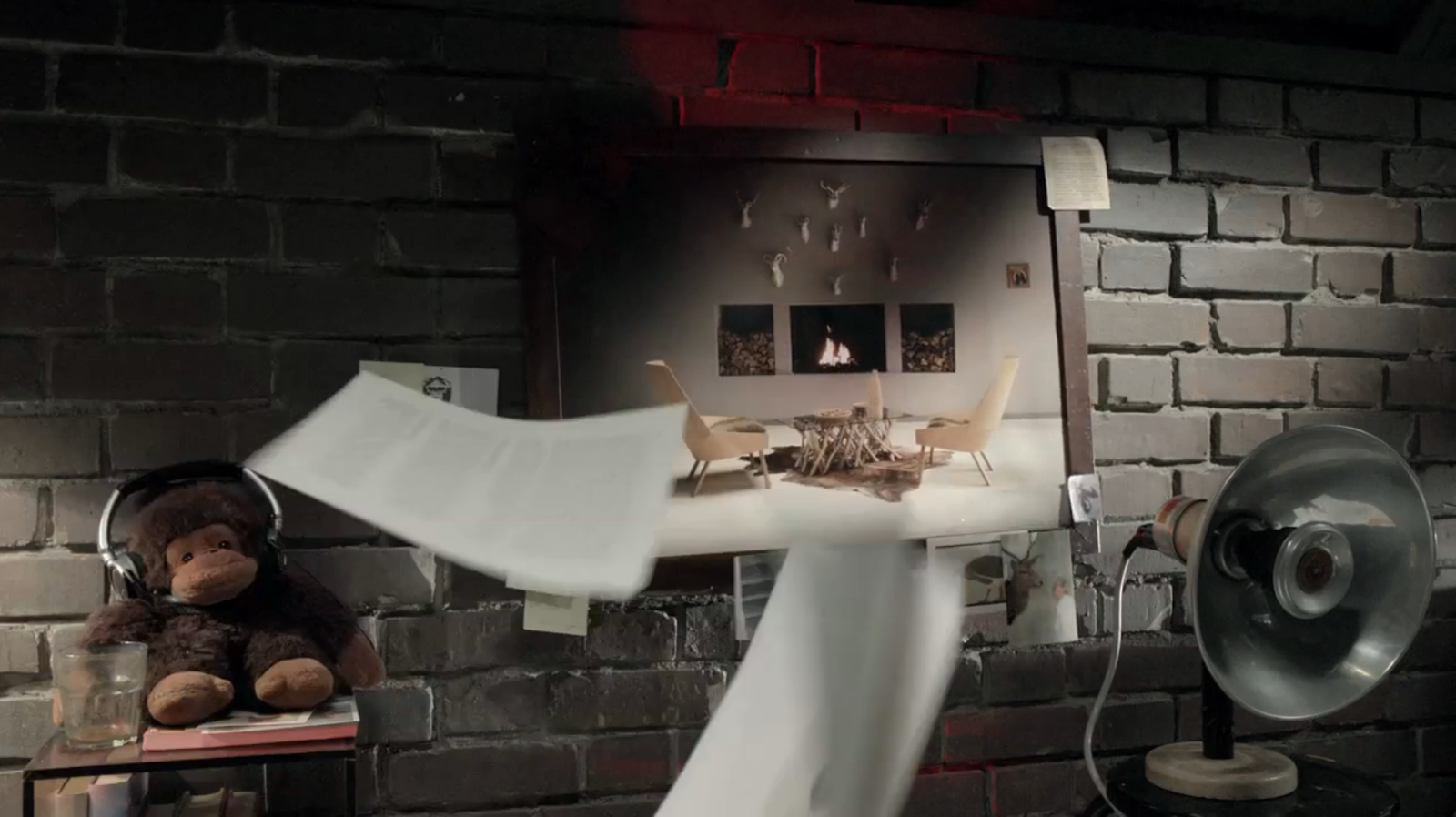
The opening shot (above) zooms/pans out to reveal the room we're in, and by focusing on the picture from the initial starting point, it gives the audience understanding that this picture is of significance to the film. The non-diagetic soundtrack is a fun, spontaneous and unpredictable track full of blips, some percussion and electronic sounds, all in which connote a sense of enigma and spontaneity.


After the camera pans across the room in a single take to reveal the main character, we are treated with a couple of simple but effective cuts, cutting from a MCU to a LMS to show the audience what he's up too, in this case, it looks as if he's making tea on the hob.

The sound of a train about to pass and the ringing of the 'warning' bells fade in, combined with the red lighting effects on the wall. As the train passes the window bursts open, blowing everything everywhere and causing the picture in the opening shot to smash and spurt out a black envelope. Whilst this scene plays out, the soundtrack fades in once again but this time it is more spontaneous and has an almost electronic rhythm to it. In my opinion, it portrays the impression that this isn't the first time this has happened before, and that the character has to deal with this problem on a daily basis.

There is also a quick cut to the picture during this scene, further highlighting the idea that this picture is of importance to the storyline.


As he closes the window, the music fades out and remains at a lower volume... this is a nice little editing technique that parallels the visuals on-screen with the audio. As he opens the envelope and looks at the picture inside, he acknowledges that the picture is more than it seems. The soundtracks continues throughout this segment and beyond at a lower volume, it helps progress the story and 'feel' of it. It rises again when the main character attempts to play a game with the woman in the other room (picture), it helps add to the humour on-screen.


The editing cuts back and forth from the main character to the woman, showing both reactions. As our main character realises another train is approaching, the intensity of the soundtrack increases, subtly triggering a sense of urgency to both the main character and the audience.

The editing in Bloodrop uses sound to its advantage throughout the piece, along with the CGI, set-design, cinematography etc. The final piece I believe is brilliant, brilliant because of its approach that is like no other I've seen. The set is beautifully and carefully designed, the effects put in place are all there to create an impact in which they do so, as well adding to the story. The contrast between the casually dressed 'everyday' man and the mysterious woman in her blue dress add another layer of sophistication to the final piece. The editing and sound I discussed earlier combined help create a fluent and natural piece that simply works.

In all, Bloodrop is fun, quirky, witty, post-modern, and most of all, different. (It's not everyday I see something that is almost completely original, but I think we have one here.)

Tuesday, 2 April 2013

Brief 2 - Rock Climbing Documentary

Me and Fraser decided it would be best to start from scratch with the rock climbing documentary edit. We felt it allowed us more freedom to implement our own ideas into the project.

After naming all the subclips and putting them into separate folders, Fraser did the task of assembling a rough cut. We went with the idea of starting off with the bedroom scene (location 1), then moving onto the bouldering location (2), and finally the climbing with ropes location (3)... after I looked at the edit, and fine-cut it, we still had to fill another 40 seconds or so. Because of this, I decided to show more bouldering footage up until the end, however I now realise that it seems as if we have two endings, which you should never have for a short film (if any)!

For this scene, I used the jump-cutting technique for when he is climbing the wall, I feel it worked well with the soundtrack and offered a different take on the standard 'one-shot' clip.

Throughout the edit I implemented jump-cuts and synced it with the music; for our first edit it worked brilliantly, however later on we found out we couldn't use the music... so in the end we had two edits, and of course went with the second one. Being brutally honest, I prefer the original    edit a whole lot more than the second one, probably due to the soundtrack and the way in which it worked so well. But on the other hand, sifting through for a fitting soundtrack for the main edit proved a challenge, but one in which we had a strong and positive outcome.

For the opening (LEFT), we went with the panning shot (on a crane) that reveals the climber achieving his goal to the top of a huge rock. We felt it was a fitting opening, a striking and memorable shot to open on that will grab the audience's attention.

Throughout the piece we aimed to give the audience breathing space, as to almost 'let them be at one' with the scenery, the location and the concept of climbing. To do this, we continuously faded in narration in small to medium bursts, never too much to lose the audience's attention with a wall of narration.


The titles also swept in from the right, not too big and over-whelming to take away the intensity on the opening shot.
We added fade-ins, fade-outs and adjusted the sound levels when the narration was played. We would lower the volume of the soundtrack when the narration was played, and rose the levels back up again subtly when it had finished.
We decided to get rid of the basement footage entirely as it was all poor quality.